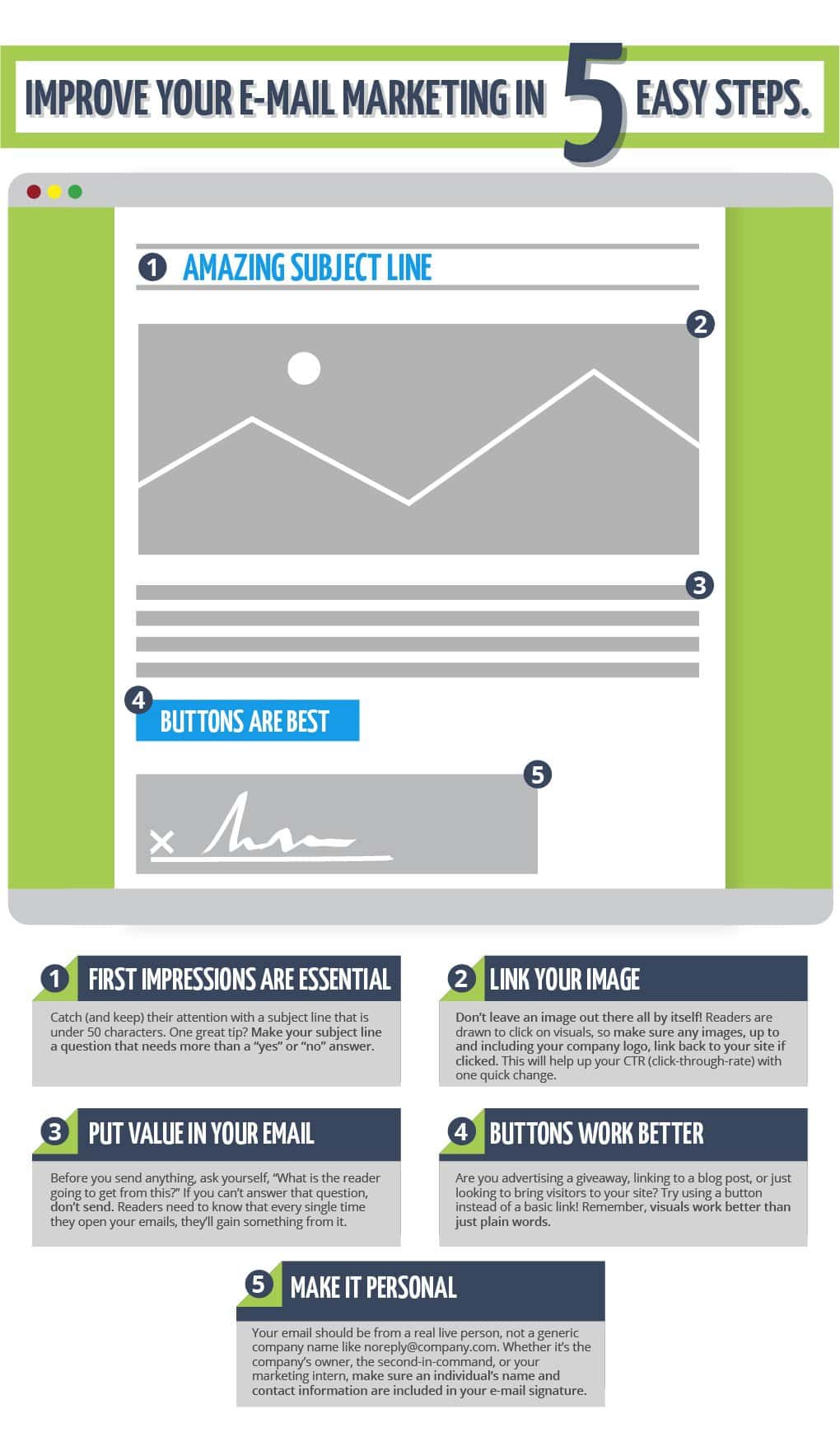
Improve Your Email Marketing in 5 Easy Steps [INFOGRAPHIC]
January 26, 2017
Managing Your Marketing Expectations with SMART Goals
March 16, 2017
An essential part of any business website is the Call-to-Action (CTA)—either an image or a single line of text directly asking the website visitor to act. CTAs are designed to encourage your website visitors to take the next step and contact you personally. While sometimes this involves filling out a form, it will just as often involve picking up the phone or even heading to your business in person. A successful CTA will help a website visitor take the next step and become a qualified lead.
What do you do if you’ve embraced the Call-to-Action but it just doesn’t seem to convert? If your CTAs are getting lots of clicks but no leads, or they’re just not getting any clicks at all, then they’re just not working for you like they should.
We’ve put together a short list of what may be going wrong — and what you can do to fix things up.
WHAT’S GOING ON (AND GOING WRONG)
Poor design will turn visitors away before they ever have a chance to engage. Design isn’t just for show, but an essential aspect of doing business in an increasingly connected marketplace. People are intensely visual, and studies have shown that our eyes tend to stay on certain color combinations for slightly longer than others. If your CTA is poorly designed, hard to read, or is just not compelling, it’s not going to encourage visitors to do anything but leave.
Take a second to look at your CTA’s placement. Is it located at the bottom of a long page full of paragraphs of text? Most readers just aren’t going to make it that far. The same problem happens with a CTA placed in a sidebar that isn’t immediately noticeable when the page first loads.
You’ve overloaded the CTAs and no one knows what they’re supposed to be looking at. Sure, it’s important to advertise promotions, new financing options, or the different areas of business you’d like potential leads to know about—but if you’ve got several CTAs all located on the same page, no one is going to know which one to click. Unfortunately, they will probably decide not to click a single one.
The CTA doesn’t have any relevance to its location. This is actually a pretty common problem, so you’re not alone! If you’re placing a CTA advertising tire repair on a page that is all about custom paint jobs, for instance, you’re just not going to get the conversions you want. Your customers aren’t on that page to think about tire repair, after all… but a banner encouraging them to click to see the different paint job options available would be likely to see much higher click-through rates.
There’s just no value in your Call-to-Action. This could actually cover a couple of issues. If there’s just no perceived benefit in taking the next step, it’s just not going to happen. If the lead does take the time to click on your CTA but discover it takes them somewhere that doesn’t follow-up on the message that pulled them in? They’ll end up moving on without ever making contact. You might end up with lots of clicks but still no conversions.
NOW YOU KNOW THE PROBLEM — LET’S START ON THE SOLUTION
Work on CTA design with your graphic designer—or hire a graphic designer. Even if you don’t have a graphic designer on staff, you may look into hiring a freelancer to ensure that your CTA fits with marketing design best practices. Remember, too, that while paying for services like this one at a time may seem cheap short-term, those costs are going to add up. You may discover it’s a better plan for your budget to invest in full-service inbound marketing like what we have here at Waypost.
No visual CTA? Give it a try. If your Call-to-Action exists only in text form, you’re automatically going to have to work harder! For the most part, people who are searching for the solution to their particular problem aren’t going to want to read line by line. If you haven’t tried utilizing a visual CTA, we recommend it!
Test out different placements to find the best spot for engagement. On sites that are heavy on the text and paragraphs, try adding your CTA at the top of the page rather than the bottom, or utilizing sidebar images that are always visible to the potential lead, even if they scroll down.
Cut out the clutter and keep things clean. Only utilize a Call-to-Action in spots that will absolutely provide the most value, and don’t go crazy adding a thousand CTAs everywhere you look. If your page looks cluttered to you, it will seem ten times worse to your site visitors. The more options a person is presented with, the harder it becomes to make a choice. Stick to one or two CTAs and let them work their magic.
Make it relevant. While that tire repair CTA didn’t work out on the custom paint jobs page, it might be a smashing success when added into your company’s blog about what to do if your tire pops while you’re driving. Try adding your CTA only to pages it is directly relevant to. As long as it’s performing well, no single CTA needs to try and be everywhere at once.
Always provide an obvious value for the lead to engage with. Are you advertising a special pricing promotion that will save your customers money? That’s a perfect value to include in your CTA! Don’t just rely on “click here to call” — try “click here to save $15 on your next visit!” You’ll find giving the lead something concrete to hold on to will make them much more inclined to take the next step.
AT WAYPOST, BEST PRACTICE IS STANDARD FOR CTAS AND BEYOND
Have you fallen prey to bad social media marketing advice that seems to be hurting your ability to bring in leads rather than helping it? Is your team struggling to put together a marketing strategy that will convert leads to customers? Are having trouble keeping up with marketing trends and you’re starting to feel like you’re too far behind to catch up?
From website design, mobile responsive, video marketing, content and email marketing, and more, Waypost Marketing is a full-service inbound marketing agency with a team that will dedicate ourselves to proving to your site visitors that you are the solution they’ve been searching for. Contact us today by phone at (864) 288-6162 or online to get started on telling your story today.


