The Power of Permission-Based Email Marketing
October 15, 2014So, what exactly is ‘Responsive Web Design’?
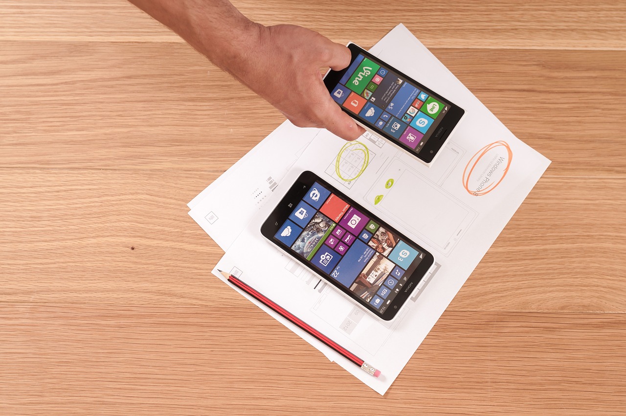
The emergence of responsive web design is largely due to the rapid growth of smartphones and other mobile devices. More people are using smaller-screen devices to view Web pages.
Responsive web design is an approach that a web designer uses to create a website that “responds to” or re-sizes itself depending on the type of device being used to view it. The objective is to have one website with elements that respond differently when viewed on devices of different sizes. The result is an optimal viewing experience across a wide range of devices, such as desktop monitors, laptops, iPads, tablets, and smartphones.
Note: In 2012, Google recommended responsive web design as the best strategy for smartphone-optimized websites.
What Does Responsive Web Design Look Like?
 If you view a traditional website on a tablet or smartphone, you might be faced with the following issues:
- You are forced to scroll horizontally which can be cumbersome on smartphones with small screens.
- Elements might be hidden from view or look distorted.
- Page load times can be slowed due to heavy graphics
The impact is also complicated by the fact that many tablets and smartphones can be viewed either in portrait orientation, or turned sideways for landscape view. Websites developed using responsive design make for easier reading and navigation and require a minimum amount of re-sizing, panning, and scrolling.
The key point is that with responsive web design, the website automatically adjusts based on the device the viewer uses to access it.
So What?
The number of people using mobile devices to access the web continues to grow rapidly; however, responsive web design may not make sense for some businesses. The cost required can be fairly significant and may not be justified by website traffic.
Traditional stand-alone mobile sites are still fine and there is no compelling reason to switch to responsive unless you are planning a website redesign. If you are thinking about a redesign, then check your website traffic to see how many people are using mobile devices to view your site. If the number is above 15% and you don’t have a mobile site, then you should consider responsive design when you’re ready for an update.
P.S. If you are not running Google Analytics or do not know how to interpret the data, then give us a call at 864-288-6162 or Contact Us online.


